Armonica: Identity + UX + NoCode development

The Challenge
Armonica is a genomics research company in the USA. The challenge was to modernize the company's visual identity and website, giving it a futuristic edge so as to win multi-million dollar fundings from investors.
Exploration
INSPIRATION: IDENTITY DESIGN
CONCEPT


LOGO
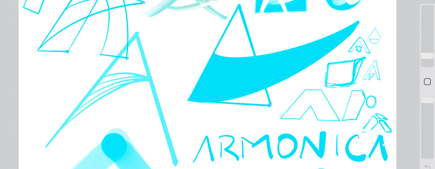
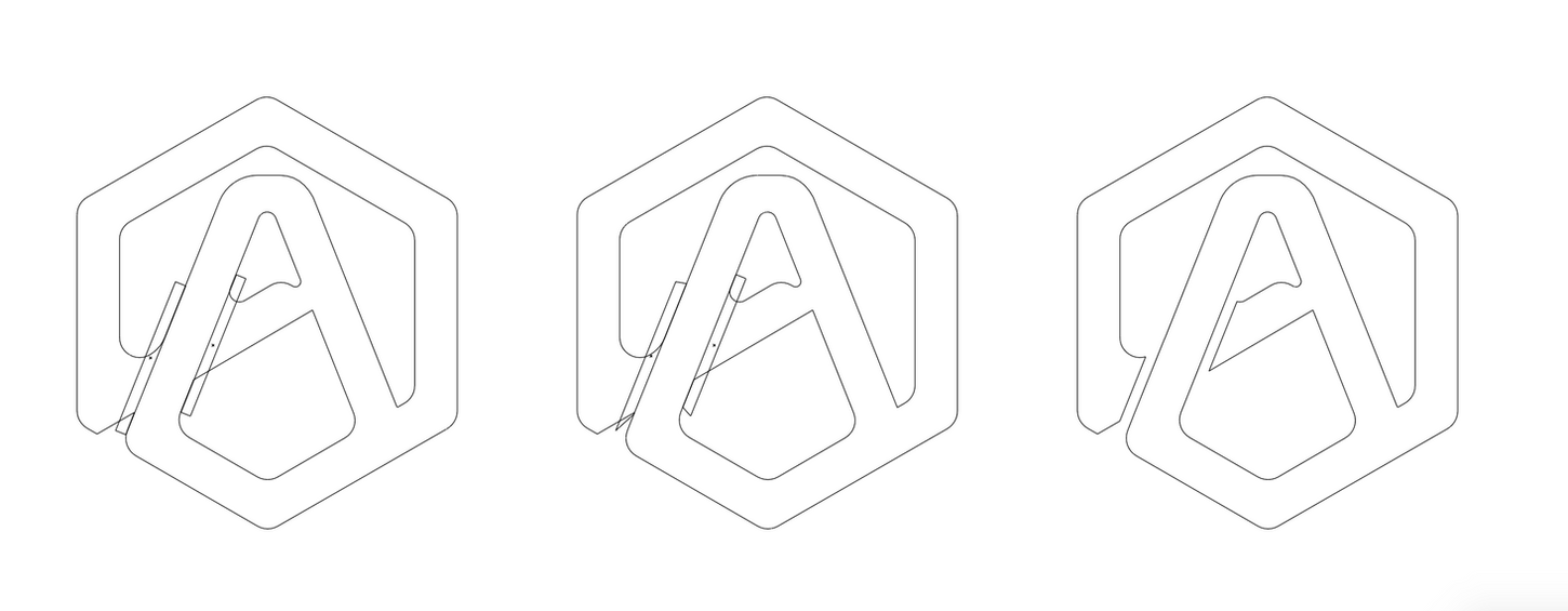
The logo was inspired by crystalline shapes as lasers that are commonly used in genomic research, use a hexagonal crystal. This signified precision in practice - a trait that is at the core of Armonica, allowing them to gather far more data than previous generations of genomic technology.
The typography for the name itself was custom made, building off from a font and changing characters until they fit naturally with the hexagonal, Crystal A monogram.
UX ACROSS PLATFORMS
RESPONSIVE

MADE WITH NO CODE
I had the privilege of developing the Armonica website, besides designing it, as the client wanted the fastest and smoothest, fully responsive deployment. In this case, we skipped the prototyping phase and dived into creating quicker, using live responsive test links..
Impact
Armonica raised over $2 million, thanks to the redesign and the subsequent fund raising efforts by the new CEO.
Their efforts to productize their cutting-edge research continues. Their next objectives are to raise more funds to ensure their research and findings in epigenetics can be used to make life better for all.


